

The existing website didn't meet the goals of the client. For that reason, the organization reached out to me to conduct research, propose and implement a solution.
My role has been to cover the complete design process. Broadly the activities included:
Working closely with the relevant stakeholders.
Primary and secondary research.
Testing the potential solutions.
Creating the required mockups.
Working together with the client's developers on implementing the updates.
Goals and Results

Based on client input, quantitative and qualitative research, two goals were set for the new website:
1) Increase page views per session.
2) Improve the visual design.
After the new website went live, not counting the first few days when the redesign has been announced, we looked at the results. The page views per session increased by 52,9%.
Current Website

On average, the writers publish two articles per week. We needed to consider this when creating the UI. Users should have the impression that there’s more content than it is. Published articles, for the most part, are not time-sensitive. Also interesting was that the home screen didn’t get the most visits. The majority of users came directly to a subpage with the article.

Besides the visual design, the old website had a critical issue seen from the screenshot of an article and later confirmed by analyzing the analytics. There was no visible incentive for the user to browse and find other interesting articles.

The format of the articles also needed to be redesigned. The line lengths were long (above 100 characters), the image placement didn’t fit with the body text flow, and the articles didn’t use any other elements to improve the readability or allow the user to scan the text.

The old website used ten visually different ways to indicate interactive elements. That provided confusion for existing and especially first time users as it’s much harder to figure out what exactly is interactive on the website.

The PageSpeed Insights tool showed slow loading speeds of the existing website.
Research
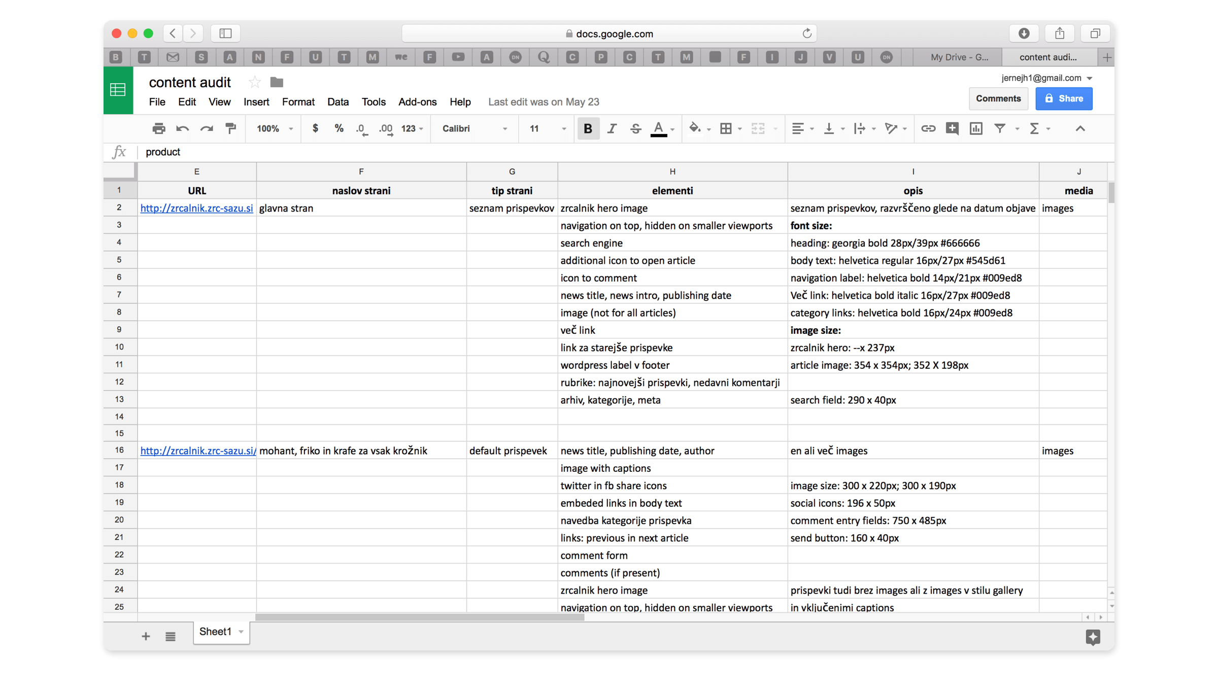
We created a content audit of the website. Based on that, a client discussion on the future content requirements followed.

To get a better feeling on who the actual users are, I visited events organized by ZRC SAZU. Additionally, the ZRCalnik Facebook page has been used to check out the users that actively follow the site and gather relevant feedback.

A survey has been sent out to existing users of the website. The goal was to determine if the issues we discovered during our research correlated with the users. We also wanted to learn about the motivations that made users visit the website and get more demographic insights.

An essential part of the research has also been to study the elements that contribute to an enjoyable reading experience. We used popular media websites and apps and took every opportunity to ask people about their impressions.

Features like User Explorer and Behavior Flow in Google Analytics, provided interesting insights into user behavior. Due to marketing activities and social media use, most of users came to the site directly to an article. The main screen had less than 15% of all page views.
Research Conclusions
Users visiting the website and events organized by ZRC SAZU, span across a wide range of age. That is a consequence of the website covering a broad aspect of content in science and arts. The survey revealed that, among others, the visual design of the website needed to be improved. We also measured and calculated the Net Promoter Score.
The NPS score has been used to compare the results before and after the website redesign. It also helps the client to measure the effect of any subsequent website changes. The focus turned to the article subpages. Having more than 85% of all page views and a high bounce rate simultaneously, it's been one of our primary focus points.
Reducing the Bounce Rate on Article Screens

Most users visited the website directly on a screen with a particular article already opened. These screens had a high bounce rate, and this was a problem that needed to be solved.

One of the alternatives was to eliminate the main screen and use the space to show the latest full article. Other articles are displayed at the side. The user always lands on an already opened article with the rest displayed in a side column. The column uses images and titles to invite the user to read more.

The proposed solution had several issues. Among other was the poor experience on smaller viewports. For users visiting with smartphones or tablets the main article takes up the whole screen real estate leaving little room to present other available content.
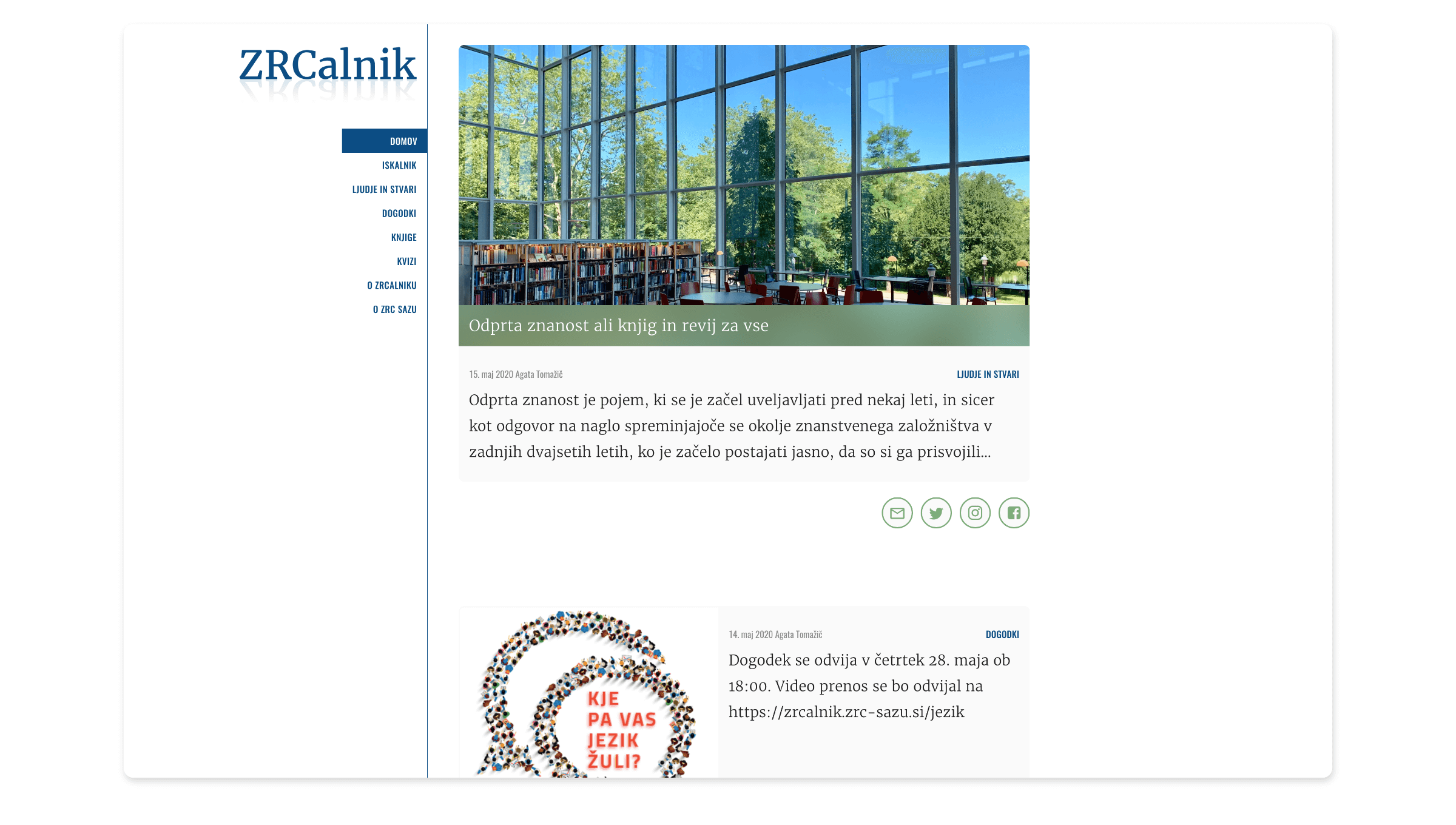
After going through some alternatives, we found the appropriate one. On the main screen, all the articles are presented in a simple vertical flow with the newest content on top.

When the user selects an article to read, the full content appears directly on the main screen by expanding the view to fit the full article.

By reaching the end of the article, other content in the vertical flow is already visible. A person only has to scroll to reach the next article.

A lot of the published content is not time-sensitive. That provides an opportunity to display articles with similar content as suggestions to read more.
Distinction Between Interactive and Non-Interactive Elements

The previous website had inconsistent ways to indicate interactivity visually. For the update, we introduced a clear distinction between the interactive and non-interactive elements. Interactive elements are either labels in all caps, icons, or article titles.

Website navigation is represented with all-cap labels in a secondary typeface. Based on the website architecture and the way articles open up directly on the main screen, there’s not much need for the website navigation elements to stand out. That is the reason it’s placed on the left side on desktop viewports. That way, there’s not much visual emphasis.
Icons have a light gray background with a stroke. The color is the same as the background of the title. This solves a confusion discovered during usability testing with wireframes. On tablet and smartphone viewports it sometimes became confusing to locate the appropriate icons with the appropriate article.
Comment Section

Most of the articles had no comments from the users despite a prominent comment section and a highly visible form placed below each article. As a consequence, it seemed like no one was visiting the website and reading the articles.

The solution on the new website is subtle. Instead of placing the comment form directly under the article, an icon has been placed as the call to action.

The comment section doesn’t stand out, and there’s not much visual difference between an article with or without comments.
Article Format

There was room for improvement regarding the article format. On the previous website the line lengths and paragraphs were too long. That made the body text heavy to read. The font size, contrast and leading were good.

The first step was to reduce the line length to around 70 characters no matter what the viewport. The content width is a result of the typeface selection, font size and the line length.

Highlights point out valuable content allowing the users to skim through the article. Highlights also break up the body text and introduce some visual hierarchy.

Articles opening up directly on the main screen require a long scroll from the user, especially on smaller viewports. When the user scrolls past the end of the article, it closes automatically.

Image galleries are used when reporting on events. In the previous website (left), the gallery was placed at the bottom of the article with multiple scattered images. The new website provides a streamlined image flow with the first one automatically being selected and expanded.
Visual Design

The backgrounds of the title and share icons are automatically color-matched with the image.

The primary typeface is Merriweather with Oswald used for navigation.

The layout of the articles provides a distraction-free reading experience with no other content fighting for attention.

On average, two new articles are published per week. Increasing the real estate for each article and making the user scroll a little more to move between content gives the impression that there’s more content than it is.